At New York Comic Con, I had the opportunity to chat with prolific colorist Matthew Wilson about his colors and process on The Wicked + the Divine and Phonogram, his relationships with various artists as well as get a sneak peek of the upcoming Black Widow series he is working on with writer Mark Waid (Archie) and artist Chris Samnee (Daredevil). Wilson first came to prominence with his colors on Phonogram: Singles Club with frequent collaborators Kieron Gillen and Jamie McKelvie and has colored a variety of Marvel books, like Thor: The Mighty Avenger, Wolverine, and Secret Avengers. He recently finished a run on Daredevil with Waid and Samnee and is currently taking a break from the Eisner nominated WicDiv as guest artists draw and color this arc. Matthew Wilson is also the colorist on Phonogram: The Immaterial Girl and Paper Girls from Image Comics and Deadpool vs. Thanos from Marvel as well as the upcoming Mighty Thor and Black Widow from Marvel.
 Pop Optiq: How did you meet Kieron Gillen and Jamie McKelvie, and how has your working relationship with them evolved from Phonogram Singles Club to today?
Matthew Wilson: I met Jamie first through a mutual friend. He had a book he was doing called Suburban Glamour. Someone had colored the first issue, and then they couldn’t do it so he needed another colorist. A writer friend of ours said, “Matt might be good on your stuff and is looking for coloring work.” It was just a friend of a friend that I met through going to conventions, and Jamie had met through message boards. He was new-ish to comics, and I was too. I had been working for a coloring studio prior to that.
PO: Which coloring studio?
MW: Zylonol Studios. It was Lee Loughridge’s (Black Canary) studio that I started working for straight out of college. At that point, I had worked for Lee for a few years and had experienced getting books done. I wanted to get my name in some books so I could go to a con as a professional. Otherwise, everything was credited to the studio where I worked. I needed my name in a book, and Jamie needed a colorist who didn’t really need a paycheck because I was getting paid for other work. The books didn’t really sell as well back then.I worked on Suburban Glamour with him for three issues, and then he and Kieron were planning the next volume of Phonogram. They needed a colorist for that and liked what I’d done on Suburban Glamour.
At first, Jamie and I talked a lot to see what he was interested in, but I mostly did what I was doing colorwise at the time, and it really clicked with his art. It was really easy. There wasn’t a whole lot of back and forth. Over the years as we’ve tried to evolve our style, we talk more now than even in the beginning.
With Kieron, his scripts are quite full. He’s got a lot of his ideas there that become subtext when it hits the final page because it’s not all written. It informs the way Jamie draws facial expressions and body movements. They’ve worked together for so long that they have back and forth language that’s really specific. It’s easy for them to get the final product through just a paragraph in the script. Then, I take from Kieron’s script and notes the mood and intention that he’s wanting to get across and convey as best I can through colors.
We all email a bunch. They live in London, and I live in Atlanta. It’s a great working relationship, and I enjoy Kieron’s writing because he has so many layers. There’s the obvious surface stuff, and you can keep digging for meaning. That helps me because when you have every color to pick from it can be paralyzing. But when I’m reading Kieron’s scripts, there’s a lot to latch onto. There are obvious directions I can take with the colors.
And then Jamie is great at conveying character’s emotions just in the facial expressions. A lot of times, Kieron will drop dialogue out of a panel because Jamie got the expression good enough so the dialogue seems like too much.

PO: How do you think the role of the colorist in general has evolved from the four color days of the Golden and Silver Ages to today’s digital masterpieces?
MW: Digital coloring is still in its infancy. It’s only been around the mid-1990s, and even then, it was a mash-up of hand guides done with markers and water colors, then another person, who could use a computer, basically hand copying into Photoshop. I did this early on at the studio with color guides and was one of the people who translated it into Photoshop.
When people don’t recognize it or give colorists the credit they deserve, I kind of understand it because it’s not something that’s been heralded as long as writers and artists. I don’t blame people for not knowing. Any time I speak to a publisher or editor about things related to this, I give them ideas about how to promote colorists because if a publisher promotes a colorist, the reader will take notice and learn more about our process.
There’s a lot of people, who don’t understand about how a book gets colored. You can come to a show and see artists’ pages and their black and white art online, but I don’t think a lot of people have it side by side to see what it looks like in black and white and color. When I show people, who aren’t in the industry, what I do, I show them the page before I get it and the page after I get it, and they immediately go, “Wow”. But if I say I color comic books, they don’t get it. I don’t blame people for not understanding.
The medium itself is evolving rapidly because the stigma of digital art is going away because a lot of younger artists grew up doing it digitally. Also, when I started, it was prohibitively expensive for a struggling artist to have a computer and to buy programs, like Photoshop. There weren’t things, like a Cintiq or a tablet to simulate drawing. The fact that those are more ubiquitous means artists have more access to these tools at an earlier age, and they’re getting better at doing it. So, we’re getting more and more good colorists coming up. Because of that influx of talent, it’d be impossible for people not to recognize it.

PO: WicDiv #14 was the special remix issue. It was very experimental. What was your role in that issue as the colorist?
MW: It was me being lost. There are certain issues in books (WicDiv’s had it twice with issue 8, or the big Dionysus rave issue and the remix issue.) where it’s clearly up to me to do something very different. A lot of time that’s the only direction I get. (Kieron says, “It’s got to be different.”) I hope that one morning I’ll have a great idea while I’ve slept. That never happens. Right up until working on it, my role was “Oh, crap. What am I going to do?”
This was time that instead of email, Jamie, Kieron, and I all Skyped. Sometimes, it’s really hard to express a lot of ideas over email unless you wanna sit there all day writing it. I thought, “If we talk, I’ll hear a word and latch onto it.” Because it was a remix, I wanted to see what they thought made a remix in terms of a song. I told them I was looking for something to put on every page as a constant beat, like if I were going to come in and remix this song, I would add this beat, but you could hear bits of the original song. That conversation helped me come up with what the constant was.

When you hear a remixed song, you can hear bits of the original in there so I dropped a lot of the original colors so you’ll see them here and there in WicDiv #14. We talked about where the story was supposed to peak and go down in terms of emotional content, and I used high energy colors. I used the shorter, faster ones in the wavelength of colors when we needed to speed up the tempo emotionally.
There was a lot of back and forth and a lot of throwing stuff at the wall to what stuck. I built a loose construct in my head of the things I wanted to accomplish and then I started experimenting on the page scene by scene. We said the same thing about issue 8, which was about making the reader feel the music and the experience of that party. That was really hard, and we spent a lot of time trying to get that right. Because of that, I was prepared for issue 14 ahead of time.We also changed a lot of word balloons with Clayton [Cowles], the letterer, who is just as involved as I am with the process.
PO: His letters have done so much to flesh out Woden as a character.
MW: Yeah, I think it’s in the back of the second trade that show him playing with different colors for Dionysus’ word balloons. We’ve tried five or six versions for character with different word balloons. There was a lot of back and forth with the team in that issue. It went quickly, but in that few days span of color and lettering, we must have sent 200 emails.
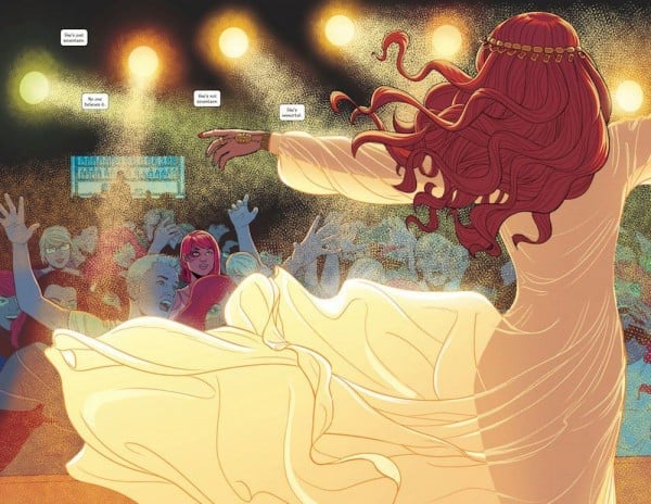
PO: What drew me into WicDiv initially was that opening concert scene with Amaterasu in issue one with the cool shimmer effect. What were you trying to do storytelling-wise with that concert?
MW: We were just coming off Young Avengers so we’d done a superhero book. In WicDiv, these characters are very much superheroes. The fight scene in issue 5 is just characters battling in the streets with powers. We didn’t want it to look just like a superhero book. We needed to have a unique voice.
Whenever the gods perform, we wanted it to look visually distinct. Not only when they’re on stage, but when they’re fighting or showing off their powers in any way, they’re performing. They know they’re being watched. No matter what they’re doing in public, they’re performing even when they’re punching each other. The first time you see that is Amaterasu’s performance so I first did the spread where Amaterasu’s back is to you. It was pretty self-explanatory as far as colors go because Jamie set it up with the house lights so you could see the light coming through her dress.
It got harder as we wanted to show her ramping up her powers, and people passing out. Then, a big story beat was that Laura was the last to pass out. We needed to show how intense that was getting. I don’t think it happened in this scene, but it happened early when we were trying to develop the look. It was easier to push it further than dial back the colors so I would turn in the colors and get notes like “Weirder” and “More”. Like a George Lucas directing note [laughs] This is all I would get back. In that scene we got it pretty quick, but in others, we would get a lot of “More’s” and “Weirder’s”.
PO: Kieron Gillen is famous for his Spotify playlist for WicDiv. What kind of music do you listen to when you’re coloring one of Dionysus’ parties, or a Morrigan performance in the Underground?
MW: I don’t work that way. When I’m reading a script or notes or developing a palette, I don’t have anything on because I can’t concentrate. But when I’m doing anything other than the early steps of reading notes and scripts, I can have anything on. Lots of times, I’ll just have movies or TV shows on. It’s almost always unrelated to my work. Sometimes, it’s music or audio books or podcasts. It’s more related to what will keep my brain engaged so I will sit here for 8 hours, like turning on a season of a TV show or a long podcast series.
Sometimes, it’s music. Jamie is friends with the band CHVRCHES so their new album has been in heavy rotation while I’ve been working on Phonogram lately.
PO: Speaking on Phonogram, how do you convey the feel of music differently in it versus WicDiv? Especially the music video scenes in Phonogram: The Immaterial Girl, which I really enjoyed.
MW: Conveying the music in WicDiv is more like tricking the reader into hearing the music because there’s no sound obviously. I’m always trying to add a psychological element to the colors and convey mood through them. It’s really heavy-handed in WicDiv because that’s what we’re trying to push.
 In Phonogram, for example, like when they go to the music videos, I’m not trying to make it look exactly like the colors from the original video. But I’ll watch those music videos a lot while I work on those issues. I look for things that Jamie took his cue from and also look at what speaks to me in them. You’ll see something in the “Material Girl” Madonna video colored in that scene and go, “That looks just like the video.”, but look at the video and see it actually doesn’t.
I didn’t make it just like the video. I picked little things, like the shininesss of her dress and made that the only heavy rendering I did in that scene. Everything else, I left a lot of flat, red backgrounds and didn’t do anything to the guys’ bright white shirts. I zero in on one thing that will trigger someone’s memory even if it doesn’t look much like the original. I try to do that with the music video stuff while in The Wicked + the Divine, I match a specific color to a specific sound on a granular level.
PO: I have a couple final questions about your work on the upcoming Black Widow series for Marvel. What’s it like working with Chris Samnee versus Jamie McKelvie, and could you tell our readers a little bit about the color palette you’ll be using in the series?
MW: Chris and I have worked together a bunch on books like Daredevil, and my one of my Marvel books Thor: The Mighty Avenger was with him. Also, behind the scenes feature: the same guy who introduced Jamie and I, introduced Chris and I. I owe this writer friend of mine my first child, I guess. [laughs]
I’ve been lucky to find a lot of artists that I fall right into sync with. Chris and I don’t have a lot of back and forth every single issue because he just likes what I do with colors. For Daredevil, we both followed someone else on that book. In that case, we had to keep the tone of that book consistent. I wasn’t trying to color exactly like Javier Rodriguez, but I studied his stuff to see where he was coming from and use the parts that made Daredevil successful in my work. It helped that Javier and I have similar styles.

In Black Widow, Chris and I get to build it from the ground up. He sent me a lot of images of art that he liked the colors and textures of so I pored over that, and we created a test image for the book. I did a bunch of versions that I didn’t like so I just decided to call Chris.Sometimes, it’s just great to talk to someone. In conversation, a word will come out that they would’ve never emailed me, and it gives me a clue to follow. We talked on the phone, and then I colored the image right away. It was great.
This was more back and forth for us, but we’re usually light on that because he puts so much in his art. With Jamie, his inking is much more open with less spotted blacks. But with Chris, light sources are immediately obvious for me to follow because he inks a lot of this into his work. Jamie will send me notes beforehand about the light’s location because his art’s more open, and he has to tell me where it’s at. I don’t get those kind of notes from Chris, and we’re this weird hivemind, and things come out smooth.
Daredevil‘s palette was very bright and poppy because Mark Waid was trying to lighten the mood of Daredevil the character. It was great because it was Matt Murdock trying to deal with the problem, then turning out it was only surface. His world needed to be brightened to sell that idea.
In Black Widow, as a kind of reaction to what we’ve done in Daredevil, we talked about making much more subdued and desaturated palettes because it’s a spy thriller story. Whenever her red hair or Black Widow symbol on her belt was visible, I would make those pops of red stand out against this sea of desaturated colors. That’s my general approach to the book, and I’m also using reds and oranges when there’s intense moments of action. When there’s fighting or she’s escaping, I’m going to focus on that.
I’m trying to limit myself as far as the colors I use, and then when she does something that is intense or action packed, I will use those reds or oranges to make the scene pop. I wanted to do that because Black Widow is so highly trained and can hang in a fight with characters, who have superpowers. Sometimes, that bugs me, but I want to show how much better she is than everybody else at whatever situation she’s in. I’m using these red colors to show her superior fighting skills even in scenes where she seems outmatched.
Paper Girls #1, Phonogram: The Immaterial Girl #3, House of M #3 and Deadpool vs. Thanos #3 are currently available on Comixology and at your local comic book store. Mighty Thor #1 is set to be released on November 11, 2015, and Black Widow #1 is coming out some time in early 2016.