Supreme: Blue Rose
Written by Warren Ellis
Art by Tula Lotay
Published by Image Comics
Supreme is a long-running and infrequently reprinted Image comic created by Rob Liefeld and with an acclaimed run by Alan Moore that has now been revived by Warren Ellis. For those who haven’t read it, it was sort of a take on Superman. Supreme’s revival is almost more of a reimagining to help familiarize new readers with an old premise. Warren Ellis’ writing style and Tula Lotay have given this well-regarded series a fresh new face and an interesting, dream-like feel to it.
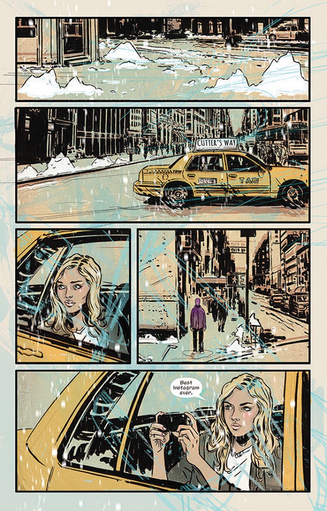
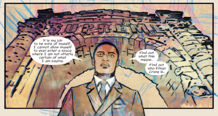
 Diana Dane is having a dream in what may be the afterlife or some pit stop on the way back from reincarnation. She discusses life and before she wakes up, she is warned not to trust Darius Dax. The catch is, she’s unemployed in New York City and Darius Dax has just offered her a job. Darius describes his interest in “blue roses,” or things that shouldn’t exist. After showing her some blurry video footage, he offers her $300,000 to figure out just what happened in that video. With literally no other prospects, Diana takes the job.
The opening conversation between Diana and the other people killed me, because it was almost as though it was some pocket dimension where comic book characters hang out before being rebooted. This places it well within the spirit of the Alan Moore run, which transformed the comic into a celebration of metafiction, and a lot of that same spirit is going on here. At the same time, I like that the focus is on Diana Dane right now and not Supreme.
As for the artwork in this story, I am loving it. From beginning to end, the comic has something of a dreamlike feel to it, especially with the reds and blues that pop up in individual panels. The shading and background is never quite what it should be, again giving that feeling of a dream in which the background hasn’t been totally sketched in. The color scheme itself has a retro feel to it, appropriate for a comic book that explicitly deals with the idea of books changing over time.