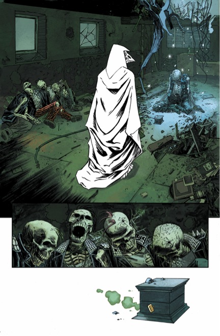
 In the comic book realm, colourists are not always held with a certain respect. Why is this? Let’s be honest, many of our most beloved characters are not the same without their red and blue tights or the yellow lightning bolt emblazoned across their chest. Sure, classic characters like Superman or The Flash represent more than just the colours of their costume, but next to the symbols on their chests, it’s the combination of said colours that culminates a history. Enter Jordie Bellaire, colourist extraordinaire. She has delved into this issue before, spawning a much needed wake up call for especially the ‘Big Two’ publishers to lay down the respect when and where it is needed most: on the front cover as a show of personal respect for the colourists.
A good colourist compliments the line work of the penciller as well as the inker of comics. There is too many times, through personal experiences, that people have muttered my way the beauty of the artist of the comics they are reading, thinking it is the product of a single individual. The ignorance that there is a sole ‘key’ contributor to the art is ridiculous. The penciller is an artist. The inker is an artist. The colourist is an artist. Hell, the writers are artists. It’s the collaboration between artists that keeps the comic industry alive; and we should all be thankful for that.
Okay, back to Jordie Bellaire. There are many great colourists out there, especially ones that collaborate frequently with a creative team; here’s looking at you Matt Hollingsworth, Dave Stewart, etc. Bellaire is one of those colourists that when I see her name attached to a title, I give a pretty solid air bump, maybe even an air guitar riff. She is a wonderful colourist. And she works on SO MANY GREAT TITLES. Moon Knight, Flash Gordon, Pretty Deadly, The Autumnlands: Tooth and Claw, Magneto, Zero, Manhattan Projects, Quantum and Woody – just to name a few.
Bellaire really formulates an understanding of each title that she works on, solidifying how different these comics would be without the proper touch of a colourist. The use of blues and reds in separating the multiple personalities of Joseph Oppenhemier in Manhattan Projects becomes more prevalent as the series progresses, revealing to be a deeper juxtaposition to the ideals represented by the American flag. The muddled use of purples and greys in the flashback sequences in Magneto shows how much the past weighs down on Magneto and his struggle to accept the tarnished armour he dons. Without these representations of colour, these books would not be the same.
Her colour palette brings such life and invigoration to the characters and worlds of Flash Gordon and The Autumnlands: Tooth and Claw. She brings on starker, darker tones in books like Moon Knight and Magneto. She also bodes well with the bizarre depths of the galaxy in the colourful Manhattan Projects and the psychedelic imagery within The Surface. Her ability to work on such a wide scope of titles, very different ones at that, and provide the proper amount of life to the worlds we as readers escape to is fantastic. All that I know is this: if Eisner Award winning colourist Jordie Bellaire’s name is attached to the title, I’m all in.


